


The Style and Design of Tech’s most distinguishable brand.
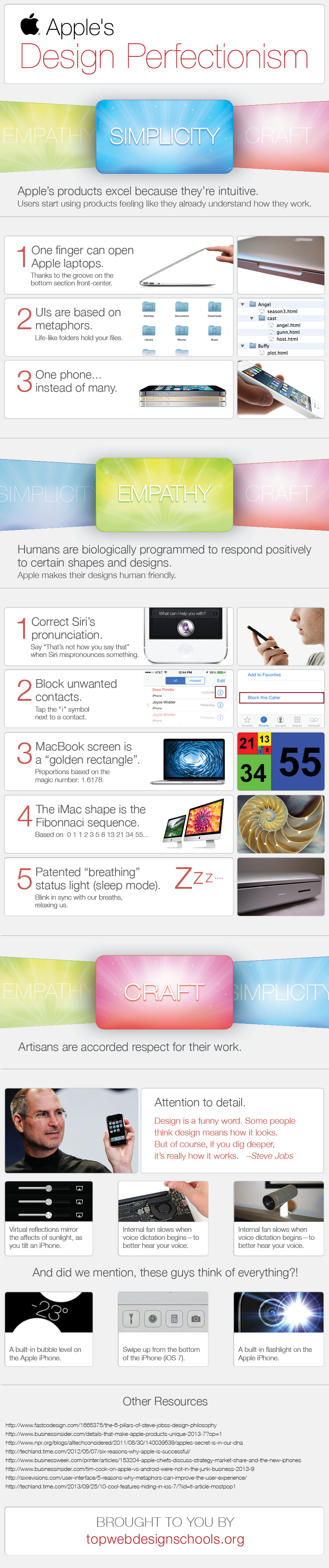
Apple’s products excel because they’re intuitive. Users start using products feeling like they already understand how they work.
1.) One finger can open Apple laptops [1]
2.) UI’s are based on metaphors:[2]
Folders
Files “stack” like papers on a desk
3.) One phone, instead of many.
4.) Clear, Crisp Lines[6]
Empathy.
Humans are biologically programmed to respond positively to certain shapes, and designs.
Apple makes their designs human friendly.
1.) Correct Siri’s Pronunciation
2.) Block unwanted contacts. (tap the i symbol next to a contact)
3.) Macbook Screen = golden rectangle
4.) Imac shape= fibonnaci sequence [3]
5.) Patented “breathing” status lights blink in sync with our breaths, relaxing us.[4]
Craft.
Artisans are accorded respect for their work.
1.Attention to detail:
Virtual reflections mirror the affects of sunlight.[7]
Internal fan slows when voice dictation begins, to better hear your voice. [8]
Hidden magnets allow webcams to be attached and level. [9]
And did we mention, these guys think of everything?
Built in bubble level.[10]
And
Flashlight.[11]
“Design is a funny word. Some people think design means how it looks. But of course, if you dig deeper, it’s really how it works.” –Steve Jobs
The Key Concepts:
Simplicity.Apple’s products excel because they’re intuitive. Users start using products feeling like they already understand how they work.
1.) One finger can open Apple laptops [1]
2.) UI’s are based on metaphors:[2]
Folders
Files “stack” like papers on a desk
3.) One phone, instead of many.
4.) Clear, Crisp Lines[6]
Empathy.
Humans are biologically programmed to respond positively to certain shapes, and designs.
Apple makes their designs human friendly.
1.) Correct Siri’s Pronunciation
2.) Block unwanted contacts. (tap the i symbol next to a contact)
3.) Macbook Screen = golden rectangle
4.) Imac shape= fibonnaci sequence [3]
5.) Patented “breathing” status lights blink in sync with our breaths, relaxing us.[4]
Craft.
Artisans are accorded respect for their work.
1.Attention to detail:
Virtual reflections mirror the affects of sunlight.[7]
Internal fan slows when voice dictation begins, to better hear your voice. [8]
Hidden magnets allow webcams to be attached and level. [9]
And did we mention, these guys think of everything?
Built in bubble level.[10]
And
Flashlight.[11]
“Design is a funny word. Some people think design means how it looks. But of course, if you dig deeper, it’s really how it works.” –Steve Jobs
Source: TopWebDesignSchools.org
;
